01
Magazine
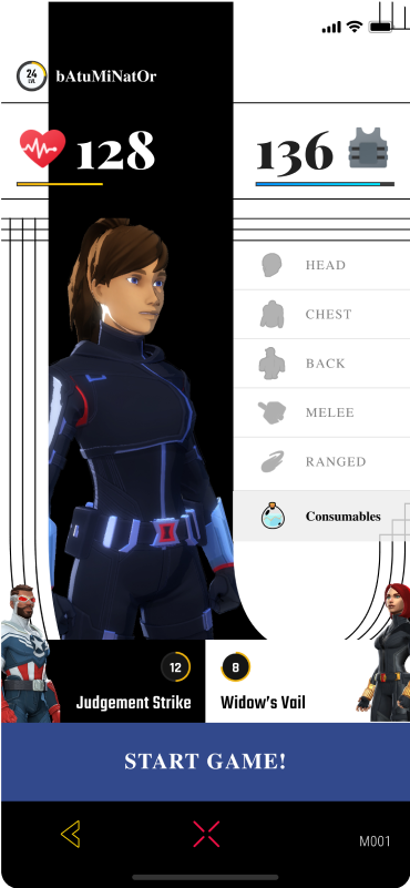
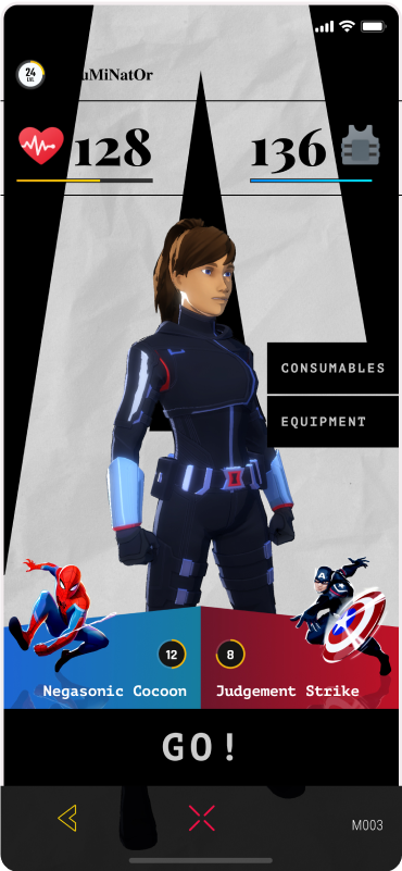
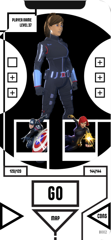
A black and white typography background supported by serif fonts, so the interface reads like a magazine page.
Game UI & Branding
Dreamspace explored more than 15 visual styles for Niantic’s Marvel World of Heroes, then redesigned the full game UI and led key branding work.
Services
The project
Marvel World of Heroes game UI design began as a research and development exercise for Niantic. Niantic is a San Francisco company that uses AR and mapping technology to blend the physical and digital worlds, guided by four pillars: draw people outdoors, inspire exploration, encourage exercise, and create connection. Best known for Pokémon GO, Niantic has since built other games, including Marvel World of Heroes.
Marvel World of Heroes was an augmented reality mobile game made with Marvel Entertainment. Players would become their own super hero, customize their look, and team up with Marvel characters in the real world. Niantic announced it on September 9, 2022, at Disney’s D23 Expo, with a global launch planned for 2023. Dreamspace worked on how the game would look, how it would be branded, and how its interface would work.
The brief
Niantic came to Dreamspace after the two teams built a working relationship on NBA All-World. The game was still a work in progress, and Niantic wanted research and development that would end with two potential visual styles.
The brief inspired the team, and Dreamspace delivered more than 15. That range exceeded expectations and changed the job: Niantic asked Dreamspace to redesign the entire game UI and handle key branding work.
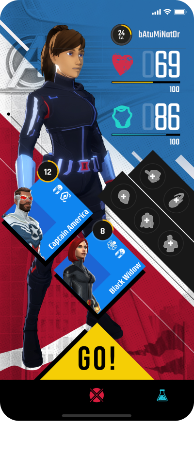
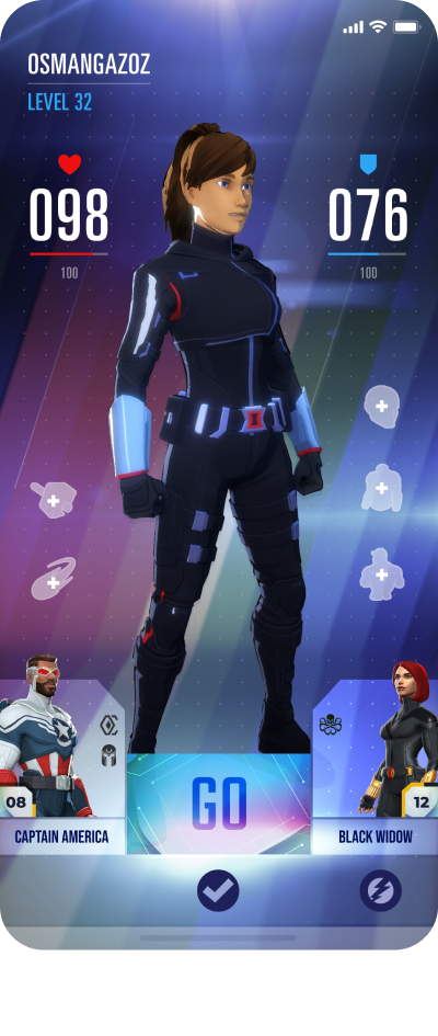
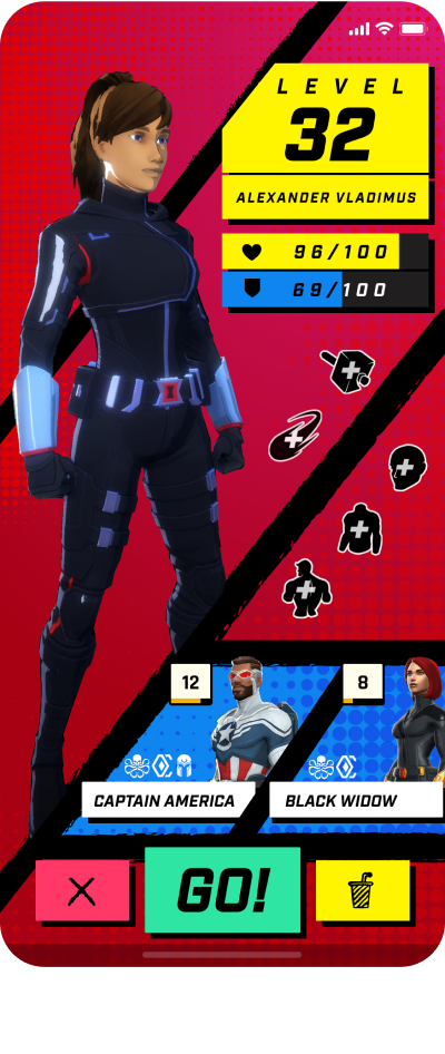
Four of the 15+ directions.
The R&D
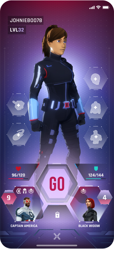
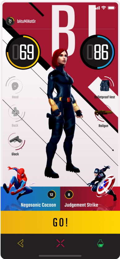
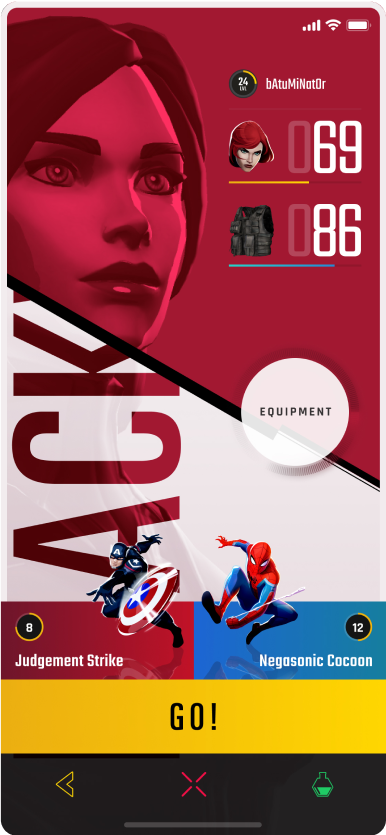
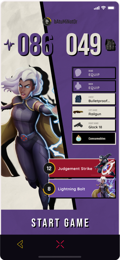
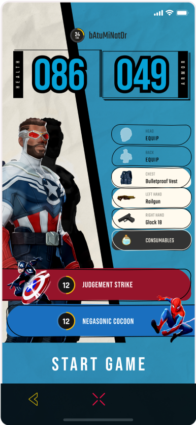
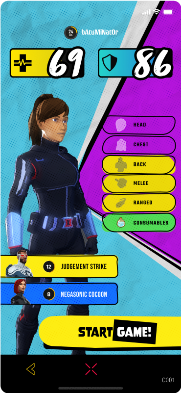
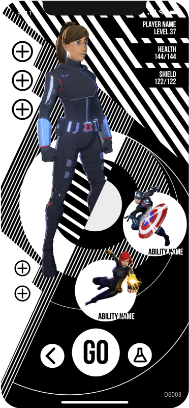
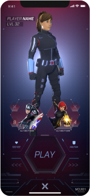
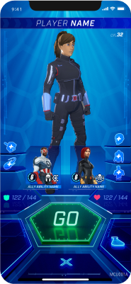
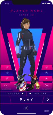
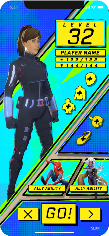
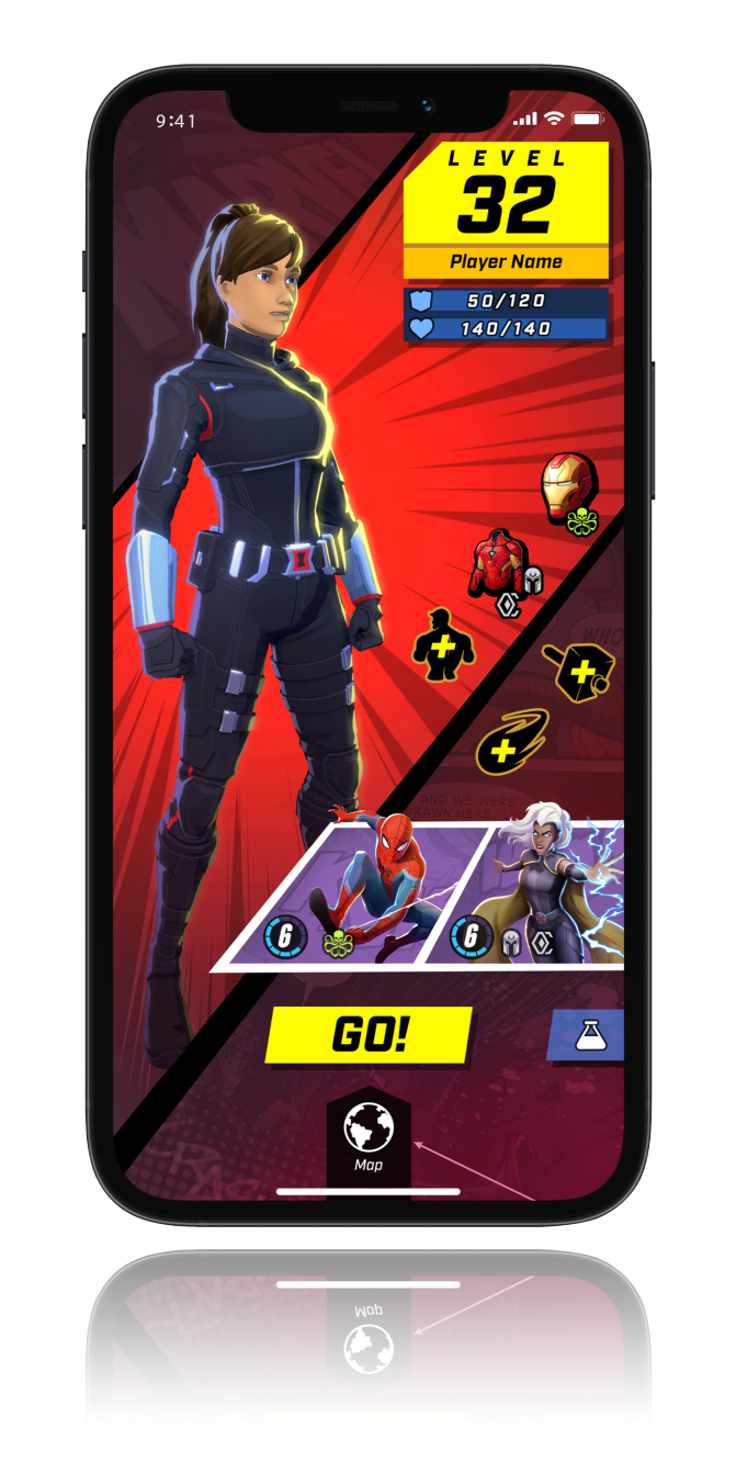
Each direction is applied to the same kind of player screen: a hero, a level, a Go button, and the controls around them. What changes is the layout, the color, the type, how much of the interface shows at once, and where the commands live.
Across all of them, the interface had to stay simple and sleek so players could navigate complex game mechanics with ease. Ten of the styles are shown in detail below.
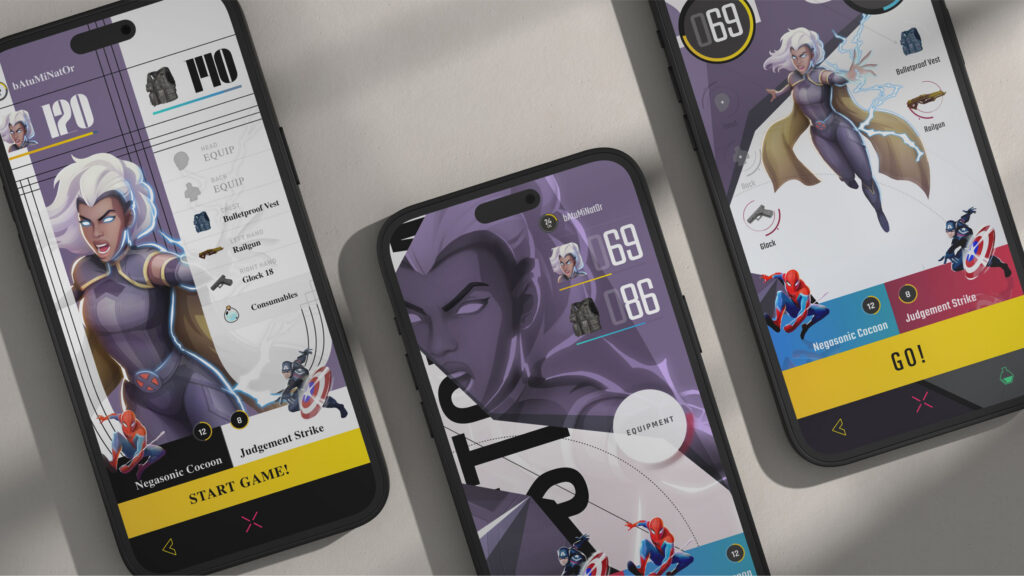
A selection of the visual directions explored.
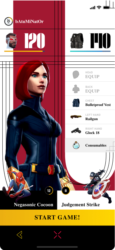
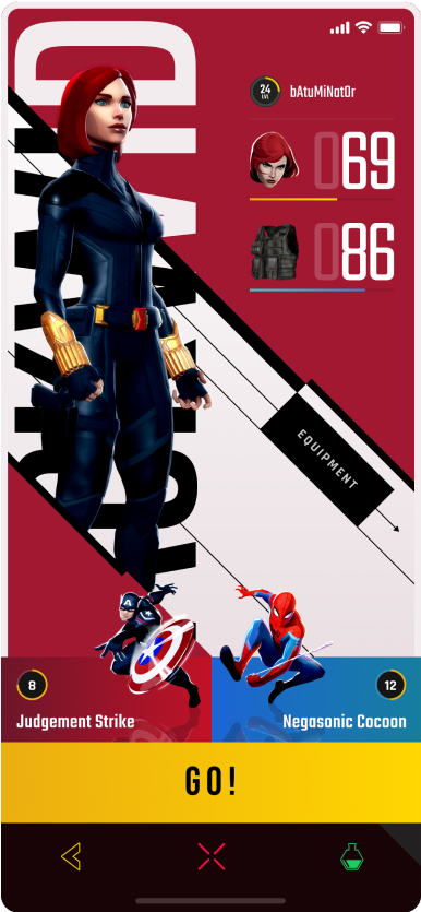
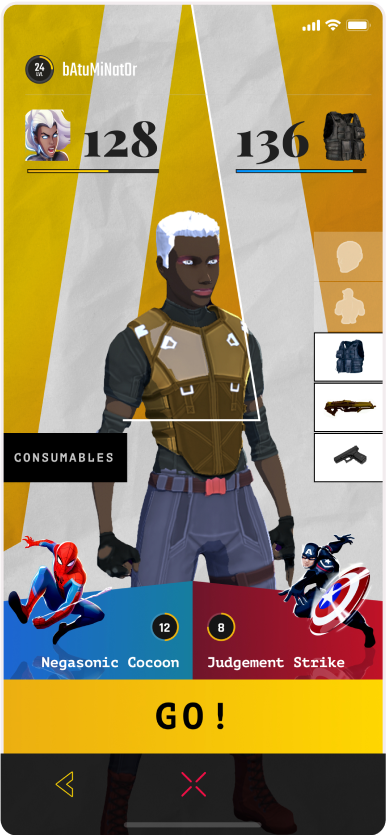
More directions, each applied to the same kind of player screen.
A black and white typography background supported by serif fonts, so the interface reads like a magazine page.
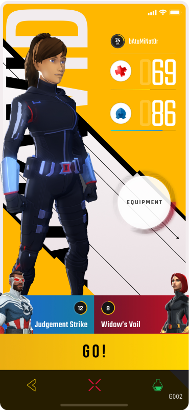
Colorful backgrounds with graphic design assets developed in sync with the character, such as skills, items, and health. Equipment sits behind a button or tab to keep the screen simple.
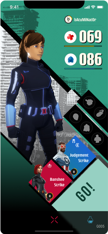
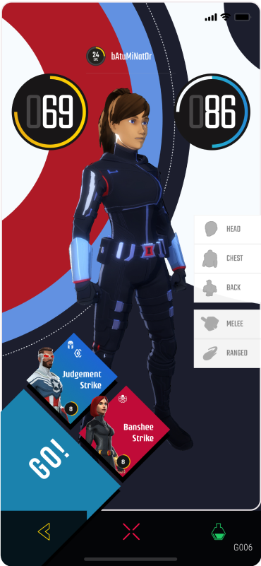
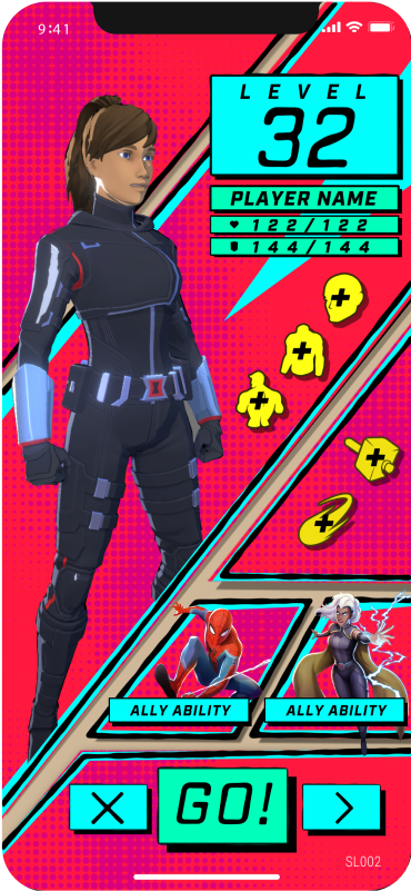
Amorphous graphic design elements, script fonts, outlines, and halftone patterns.
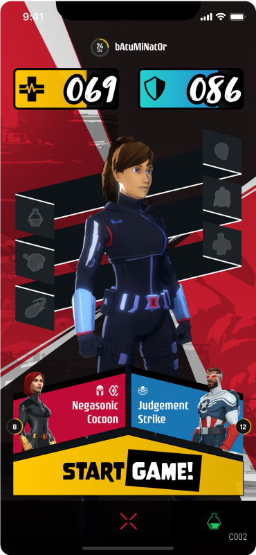
Explores the 2D grid in depth. The essential commands are 3D buttons at the top, and the content sits in an infinite space behind them. A playful mix of 2D and 3D that carries players into their own imagination of the Marvel universe.
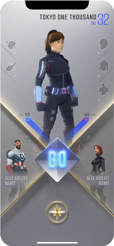
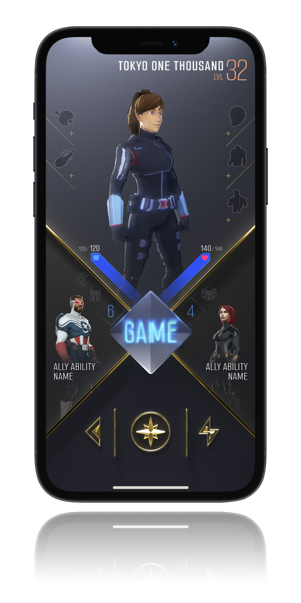
A clean layout with a bold color palette. Three colors, blue, yellow, and orange, show the level of the player, and the scheme is fully customizable.
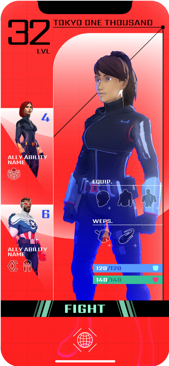
Combines styles from different design genres, including Bauhaus, retro arcade, and geometric art.
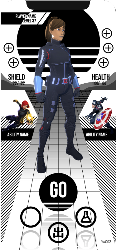
Takes the look of a traditional MCU interface and pushes it further, using transparency and hexagons throughout.
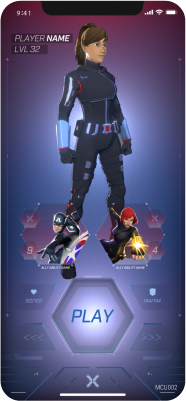
Frames designed with Art Deco styling in mind: a more elegant layout that keeps the style’s iconic shapes.
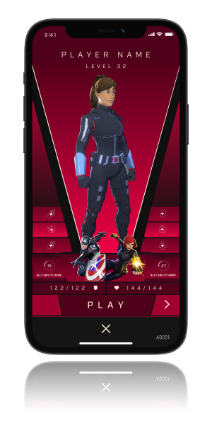
The closest to a traditional game inventory. Everything sits in a grid, with a place for everything and everything in its place.
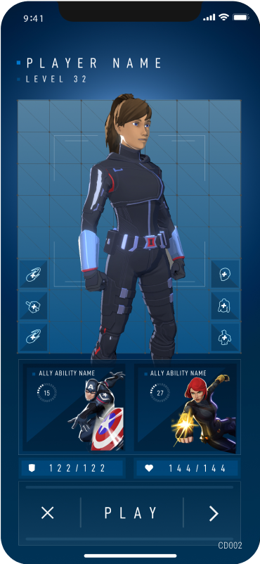
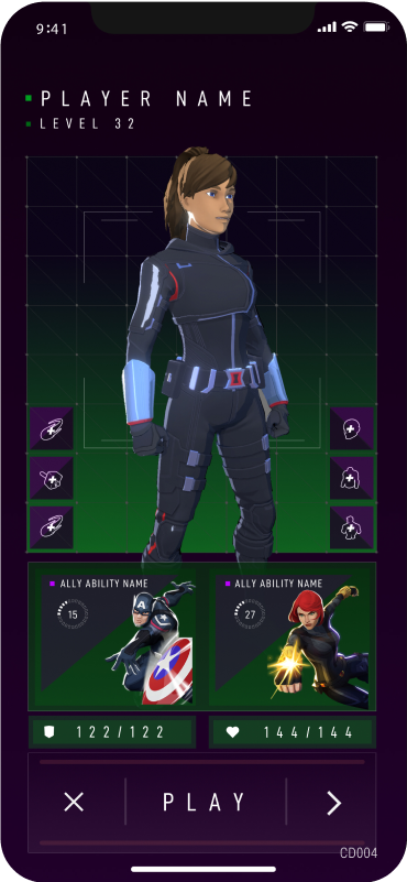
Inspired by the comic books of old. Varying line weights, comic panels, and halftones give it the feel of the Golden Age of Comics.
The game UI
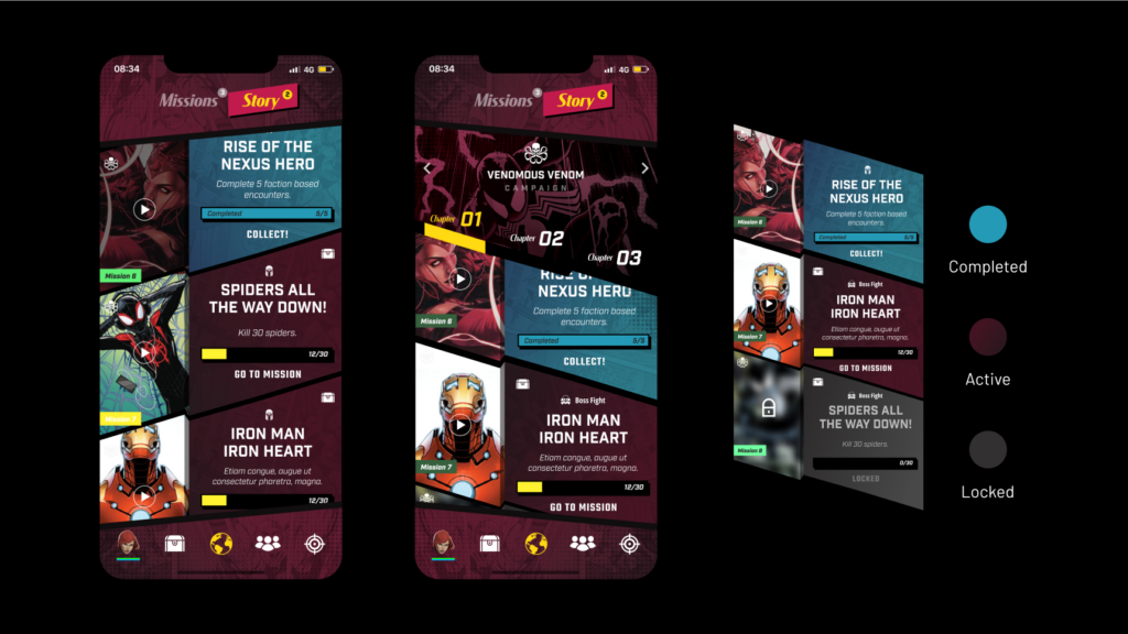
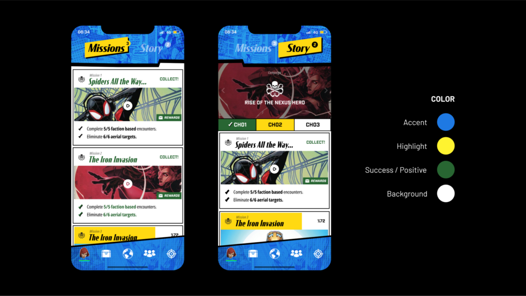
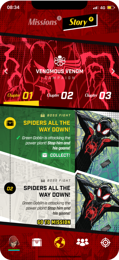
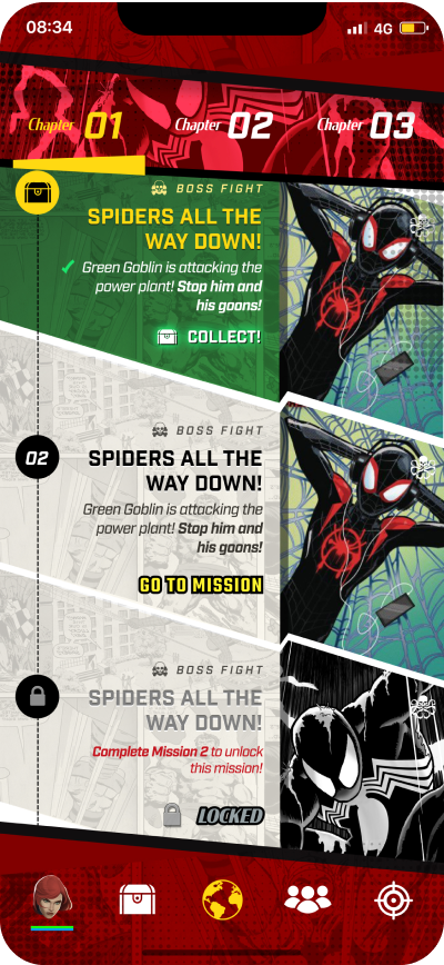
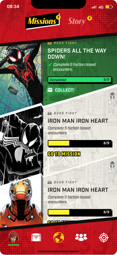
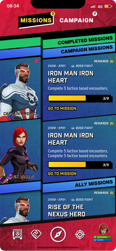
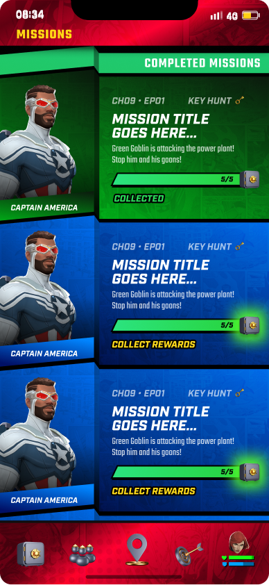
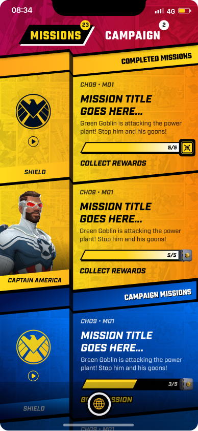
Two of the major screens Dreamspace reworked were Missions and Campaigns. Both are complex from a UX and UI point of view, and Niantic asked for a large amount of information to be distilled into a design that is attractive and easy to take in.
The team worked through five color directions, each with its own palette. In one of them, completed, active, and locked missions each get a color of their own.
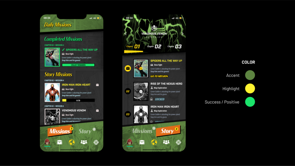 Color direction 1
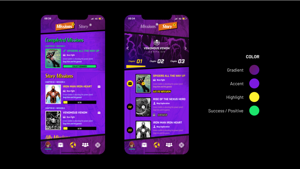 Color direction 2
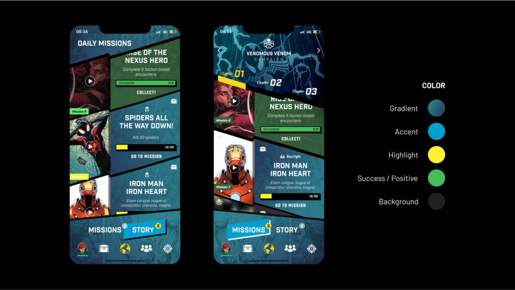 Color direction 3
 Color direction 4
 Color direction 5
 Player screen in a phone frame
Design system
Niantic directed that Marvel World of Heroes preserve its quintessential comic book aesthetic and structure. That was not a straightforward challenge. By analyzing and prioritizing the importance of each UI component, Dreamspace designed an interface that held all the essential information, met the requirements of the game mechanics, and kept the comic book style players love.
The solution was a layout built on a 5-degree angle.
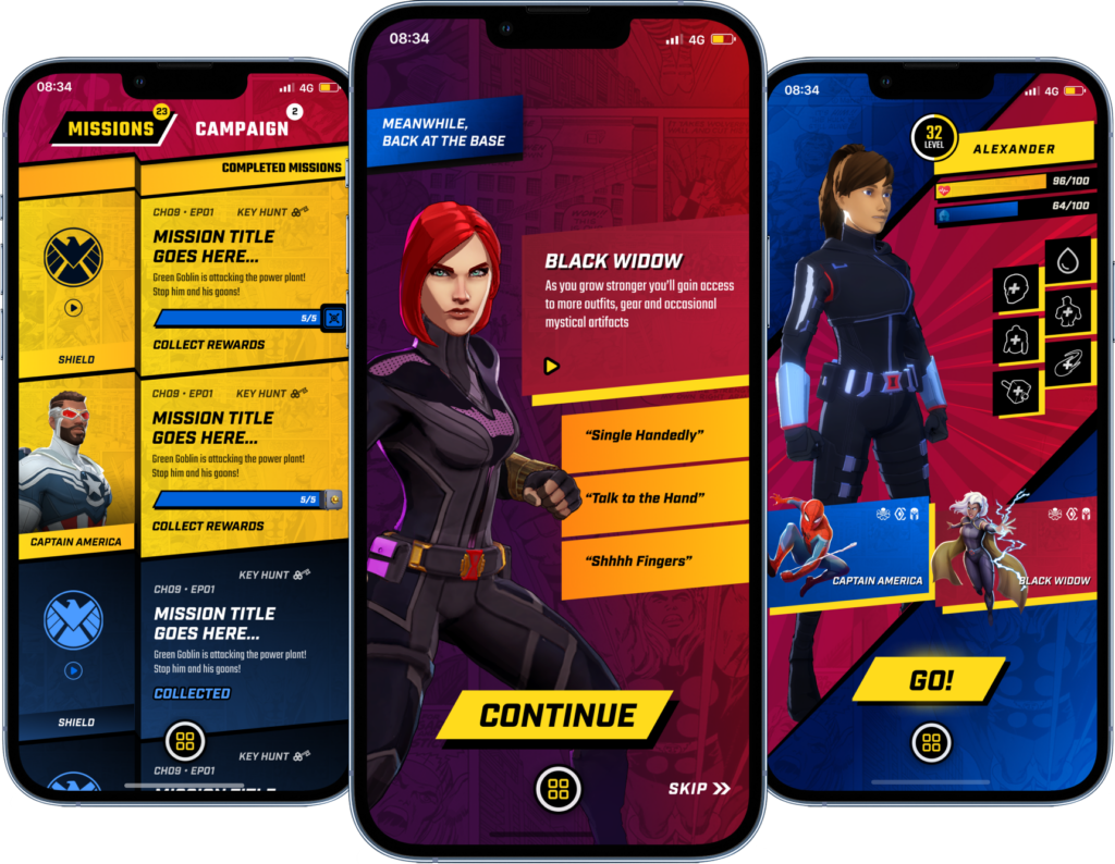
The 5-degree layout applied to the game UI.
Design system
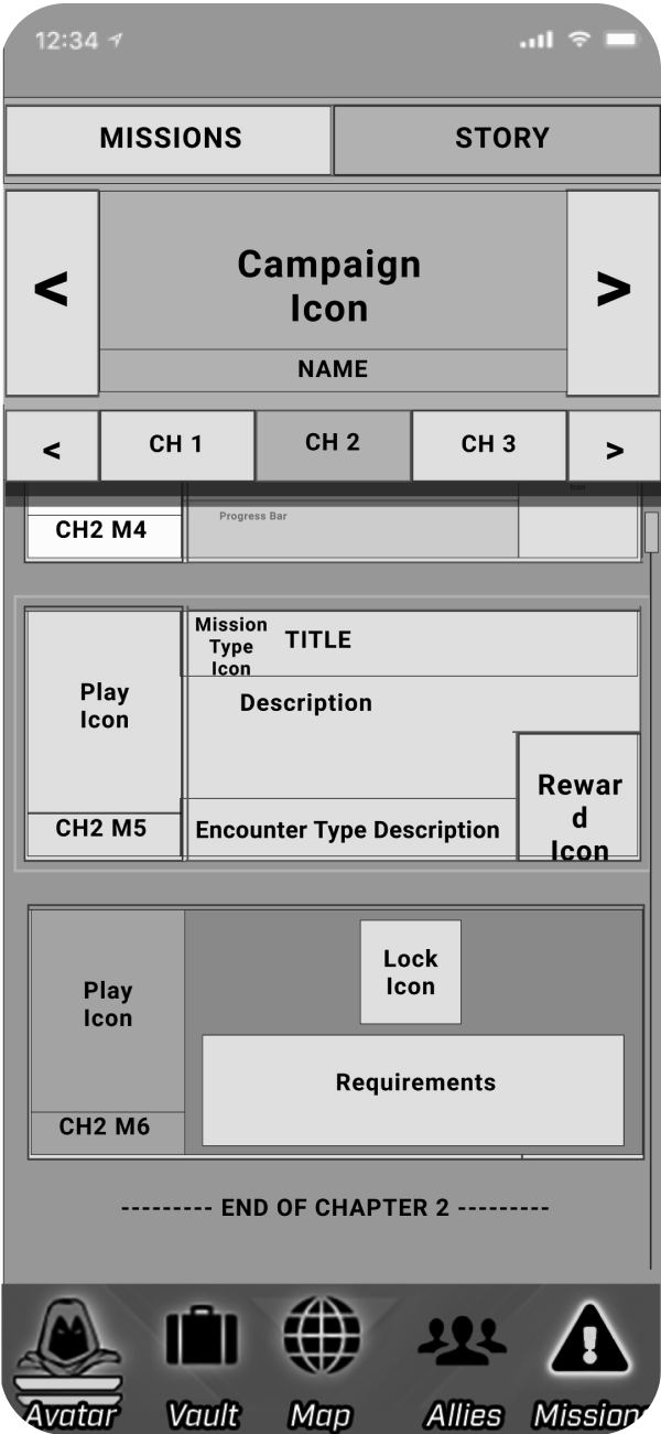
The work began with a set of basic UI mockups provided by Niantic. The 5-degree layout created spatial challenges, so Dreamspace used a range of design strategies to compensate:
That last choice reflects the importance of a cohesive menu structure across the Niantic user experience.
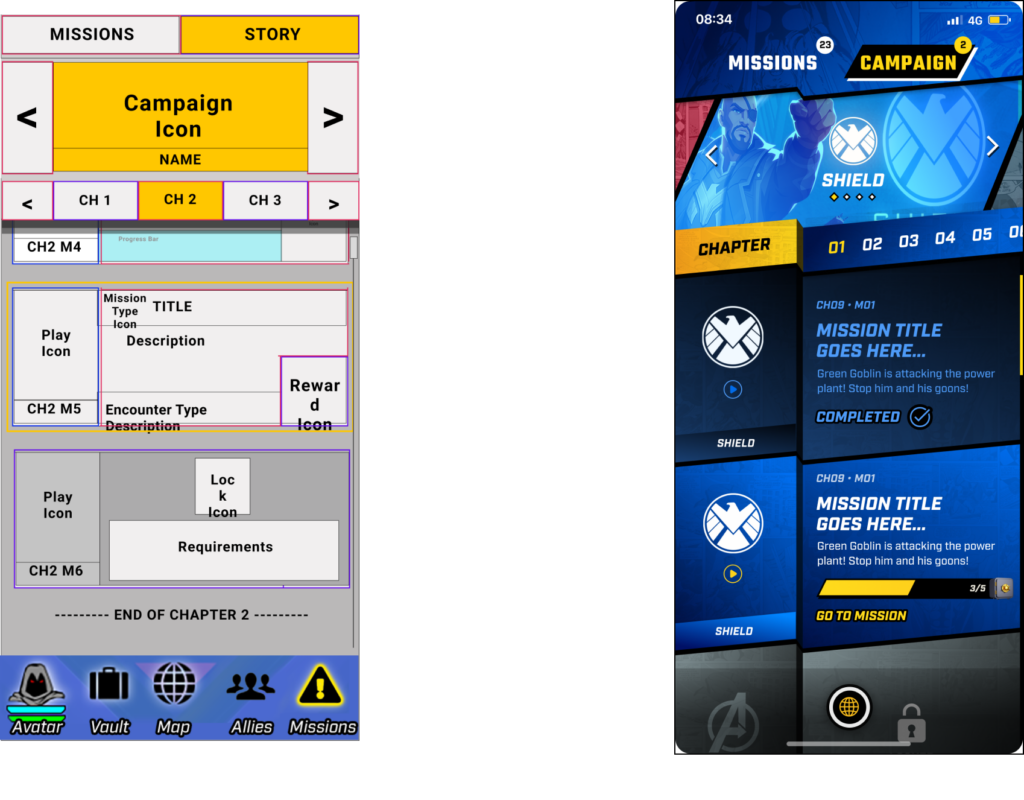
From basic UI mockups to the final interface.
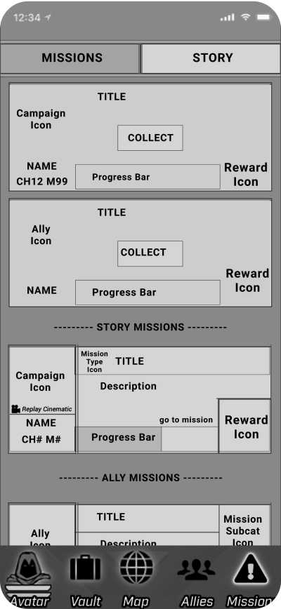
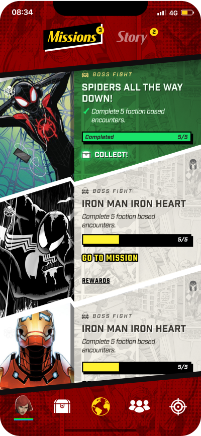
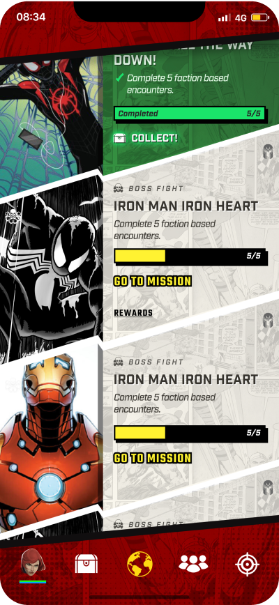
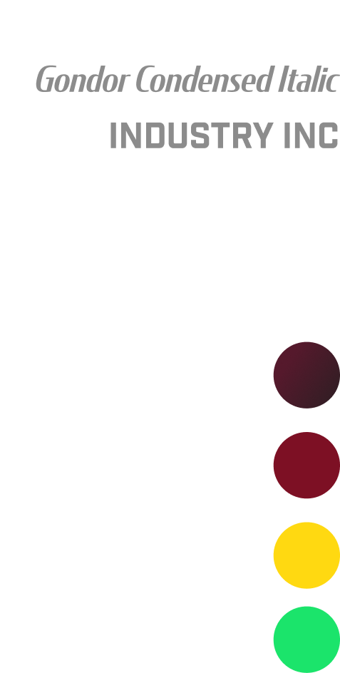 UI color legend
Design system
Industry Italic is the primary typeface. Its 10-degree angle acts as an elegant counterbalance to the layout and strengthens the comic book look and feel. Teko, a clean and legible typeface, is the secondary choice and complements the same aesthetic.
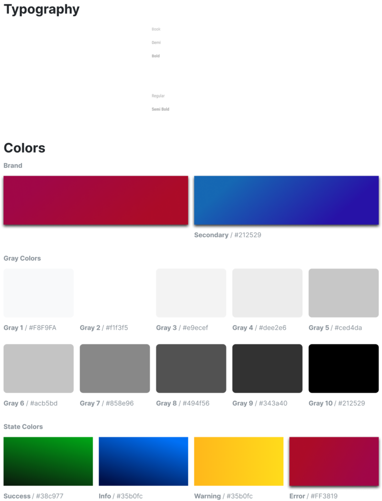
Type and color specification.
Design system
The primary color is a deep red that echoes the iconic Marvel logo and anchors the game in the Marvel universe. Electric blue acts as a dynamic counterpoint, creating cohesion and adding excitement. Secondary colors, including yellows, greens, and a spectrum of grays, enrich the comic book aesthetic.
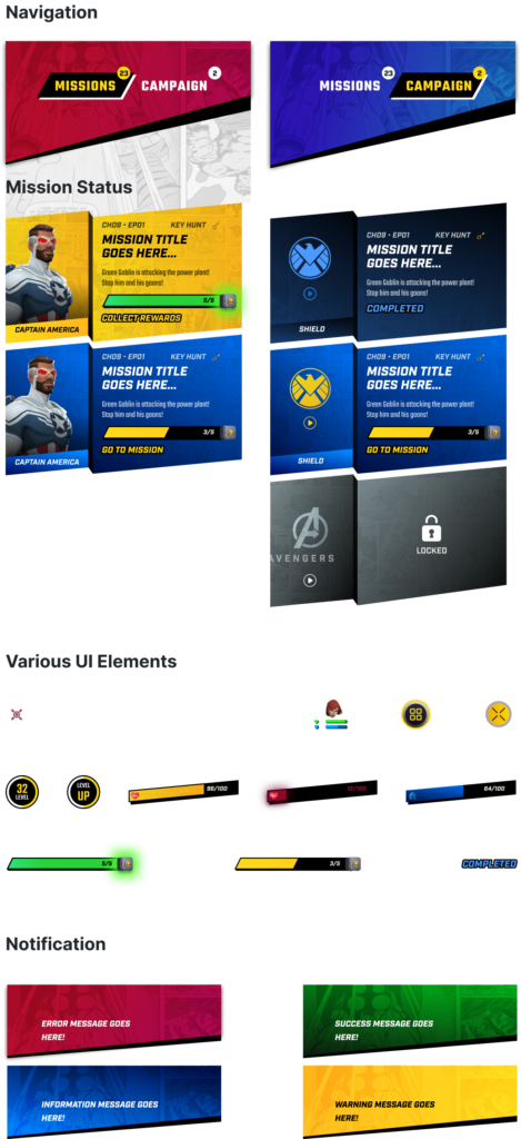
Color usage across the interface.
Design system
Dreamspace designed more than 100 custom icons for the game.
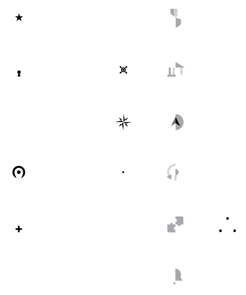
The custom icon set.
The process
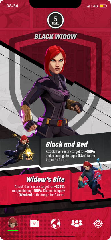
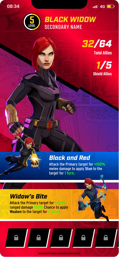
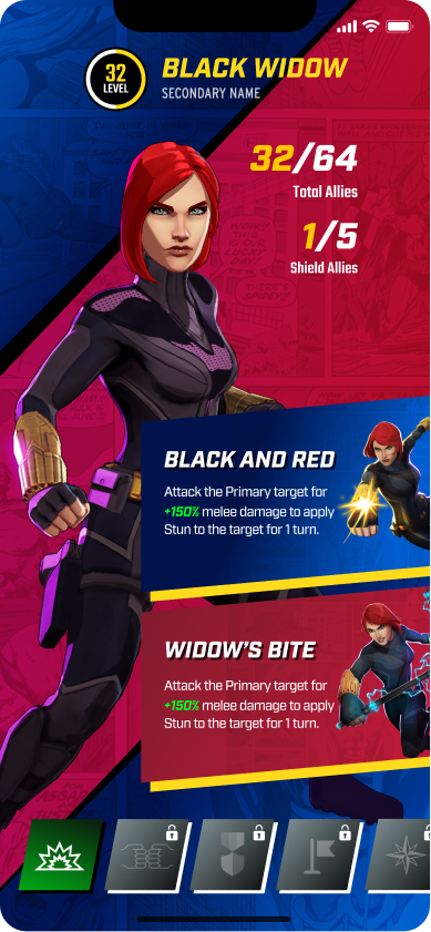
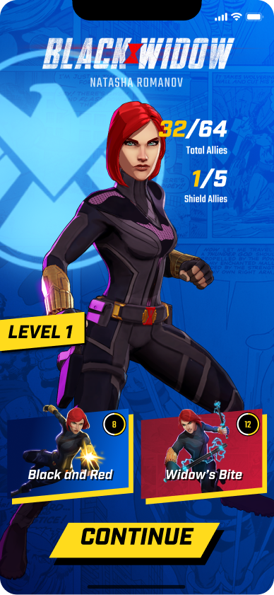
Over three weeks, in a series of four-hour work sessions with Niantic, Dreamspace crafted more than 200 distinct screens across a variety of styles. Along the way, the team addressed every facet of the UI and delivered a comprehensive style guide. That gave Niantic the flexibility to adjust and update design elements at its own discretion.
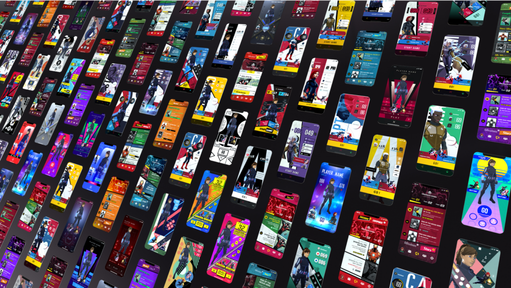
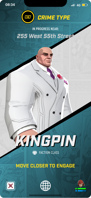
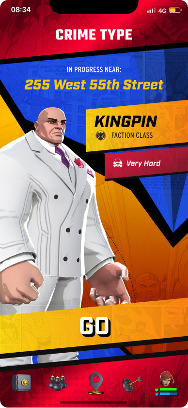
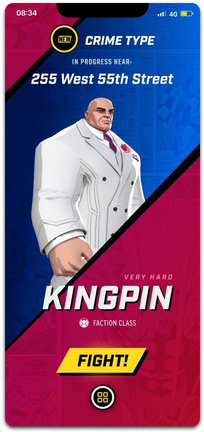
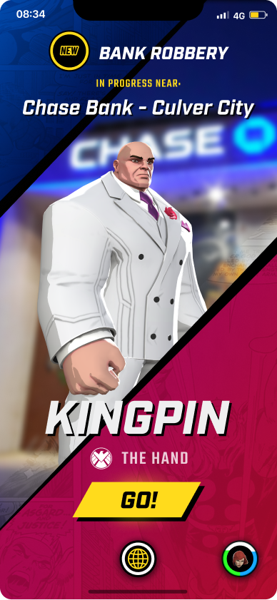
More than 200 distinct screens across a variety of styles.
The brand
You become your own Marvel super hero, in the real world.
Marvel World of Heroes is the first game in the Marvel franchise where players can become their own Marvel superhero in the real world. Niantic also asked Dreamspace for the game’s logo, app icon, and brand identity.
The team moved from research and a mood board to sketches, then through rounds of review with Niantic and Marvel to refine the marks. The W takes its angle from the game’s UI and reads as a player and Marvel heroes teaming up to win battles: victory and unity. The O is drawn as a portal.
Dreamspace applied a wide range of color treatments within the logo design, paying homage to the game’s multiverse feature and to the iconic Marvel Studios introduction video. The original R&D work influenced and informed many of the color palettes and graphic elements within the logos.
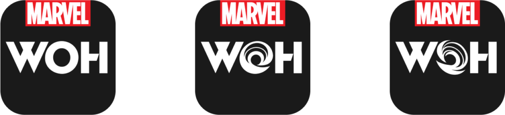 App icon options.
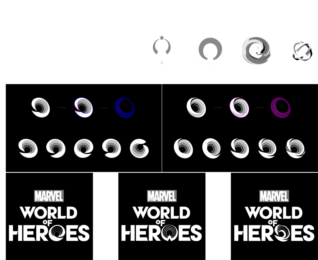 The O as a portal.
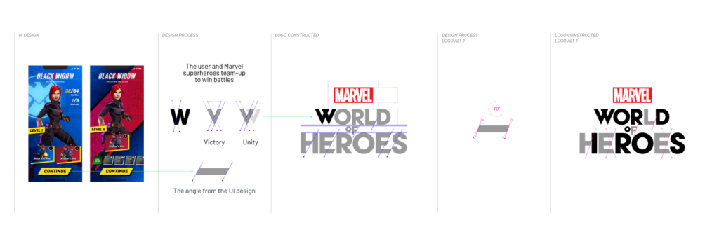 Logo process.
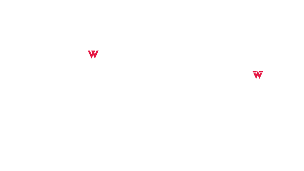 The W, built from the angle of the UI, and W explorations.
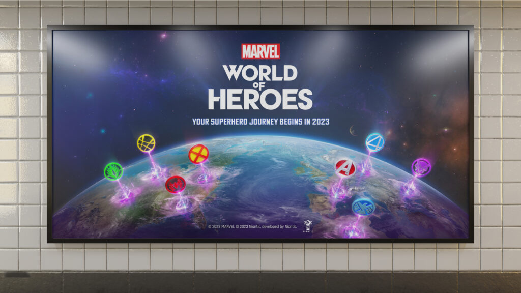 The logo on key art, in a billboard mock-up.
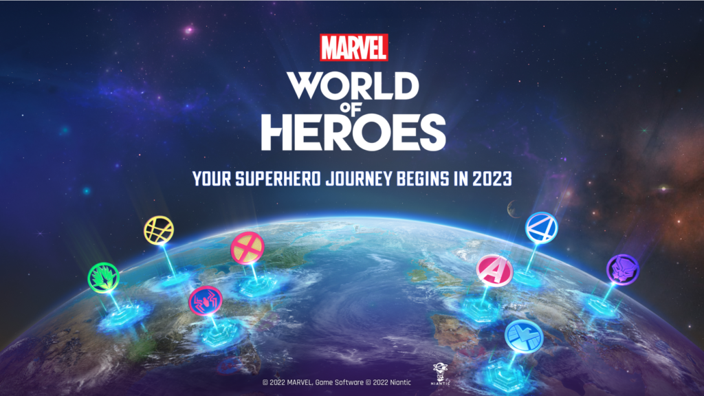 The logo on key art.
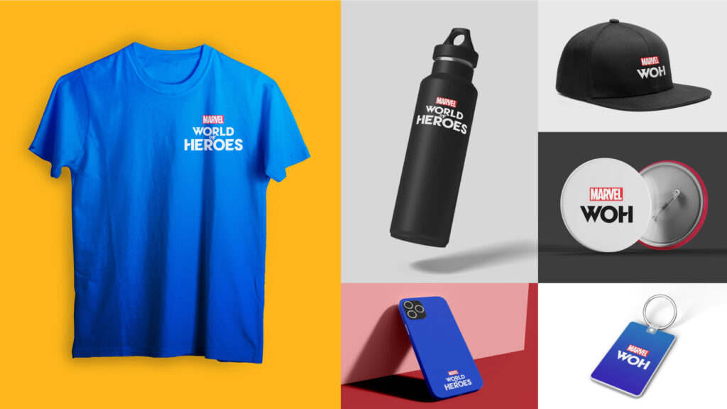 Merchandise mock-ups.
The result
What began as a request for two visual styles grew into the full game UI redesign and key branding work for Marvel World of Heroes. In three weeks of focused sessions with Niantic, Dreamspace delivered more than 200 screens and a complete style guide, giving Niantic’s team the tools to keep refining the design on its own.
Games ask a lot of an interface. Dreamspace designs UI and brand systems that stay clear under complexity and still feel true to the world they belong to. Explore more game design work, learn about our branding services, or see all of our work.
Credits and notes. Client: Niantic, with Marvel. Dreamspace carried out the research and development, designed the logo, app icon, and brand identity, and designed the game UI, including the Mission and Campaign screens. Images are from the project, and the billboard and merchandise images are mock-ups.
Marvel World of Heroes, Marvel, Disney, and Niantic, along with their characters, names, and logos, belong to their respective owners. The game was not released, and the screens shown are design work.